

Custom Controls in JavaFX (Part II)
- February 05, 2021
- 4 min read
Last time we saw how to create custom controls in JavaFX by simply playing around with CSS styles for the component.
This time I will show you how to create a custom control by combining existing controls. The idea is to create a control that contains a text field where you can type in values and next to the text field should be a button that when pressed will convert the value from the text field to another value.
To realize this, we simply create a class that extends HBox and add a TextField and a Button to it.
The code of that control looks as follows:
public class CombinedControl extends HBox {
    private TextField textField;
    private Button    button;


    // ******************** Constructors **************************************
    public CombinedControl() {
        getStylesheets().add(CombinedControl.class.getResource("combined.css").toExternalForm());
        initGraphics();
        registerListeners();
    }


    // ******************** Initialization ************************************
    private void initGraphics() {
        getStyleClass().add("combined-control");

        textField = new TextField();
        textField.setFocusTraversable(false);
        textField.setTextFormatter(new TextFormatter<>(change -> change.getText().matches("[0-9]*(\\.[0-9]*)?") ? change : null));

        button = new Button("°C");
        button.setFocusTraversable(false);

        setSpacing(0);
        setFocusTraversable(true);
        setFillHeight(false);
        setAlignment(Pos.CENTER);

        getChildren().addAll(textField, button);
    }

    private void registerListeners() {
        button.setOnMousePressed(e -> handleControlPropertyChanged("BUTTON_PRESSED"));
    }


    // ******************** Methods *******************************************
    private void handleControlPropertyChanged(final String PROPERTY) {
        if ("BUTTON_PRESSED".equals(PROPERTY)) {
            String buttonText = button.getText();
            String text       = textField.getText();
            if (text.matches("^[-+]?\\d+(\\.\\d+)?$")) {
                if ("°C".equals(buttonText)) {
                    // Convert to Fahrenheit
                    button.setText("°F");
                    textField.setText(toFahrenheit(textField.getText()));
                } else {
                    // Convert to Celsius
                    button.setText("°C");
                    textField.setText(toCelsius(textField.getText()));
                }
            }
        }
    }

    private String toFahrenheit(final String text) {
        try {
            double celsius = Double.parseDouble(text);
            return String.format(Locale.US, "%.2f", (celsius * 1.8 + 32));
        } catch (NumberFormatException e) {
            return text;
        }
    }
    private String toCelsius(final String text) {
        try {
            double fahrenheit = Double.parseDouble(text);
            return String.format(Locale.US, "%.2f", ((fahrenheit - 32) / 1.8));
        } catch (NumberFormatException e) {
            return text;
        }
    }
}
If we would use this control without applying a CSS file it would look as follows:
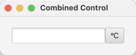
Well that's in principle fine, but I would prefer a more integrated look. Now it still looks like we have two controls, while it should more look like a single control.
To achieve this, we need to modify the CSS styles of the TextField and the Button. The things we need to change are the corner-radii on the right side of the TextField and on the left side of the Button. And, not to forget, the focused state of the control which should appear as one focus border around the control.
As you can see in the code, we have set the focusTraversal for the TextField and the Button to false to make sure that they don't catch the focus when "travelling" the focus through the application using the tab key.
For that reason, we have to define a CSS style that is the same for the normal and the focused state for the TextField. For the Button we need to define separate styles for normal and focused state.
The CSS style for the TextField looks as follows:
.combined-control > .text-input,
.combined-control > .text-input:focused {
    -fx-background-color: linear-gradient(to bottom, derive(-fx-text-box-border, -10%), -fx-text-box-border),
                             linear-gradient(from 0px 0px to 0px 5px, derive(-fx-control-inner-background, -9%), -fx-control-inner-background);
    -fx-background-insets: 0, 1 0 1 1;
    -fx-background-radius: 3 0 0 3, 2 0 0 2;
    -fx-pref-width: 120px;
}
As you can see, we set the background radius for the right two corners of the TextField to 0.
For the Button, the CSS styles now look as follows:
.combined-control > .button {
    -fx-background-radius: 0 3 3 0, 0 3 3 0, 0 2 2 0, 0 1 1 0;
    -fx-pref-width: 36px;
    -fx-min-width: 36px;
}
.combined-control > .button:focused {
    -fx-background-color: -fx-outer-border, -fx-inner-border, -fx-body-color, -fx-body-color;
    -fx-background-insets: 0, 1, 2, 2;
}
With these CSS styles in place, our control looks as follows:
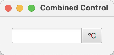
Now we have the effect that we have been looking for, it looks like one control instead of two combined controls.
Now the hard part is to style the focus correctly, to be honest I was lazy and just tweaked it as long as it nearly looks the way I wanted it to look by using the following CSS styles:
.combined-control:focused {
    -fx-highlight-fill: -fx-accent;
    -fx-background-color: -fx-focus-color, -fx-control-inner-background, -fx-faint-focus-color;
    -fx-background-insets: -1.2, 1, -2.4;
    -fx-background-radius: 3, 2, 4, 0;
    -fx-border-color: -fx-faint-focus-color;
    -fx-border-insets: -1;
}
.combined-control:focused > .button {
    -fx-background-color: -fx-focus-color, -fx-outer-border, -fx-inner-border, -fx-body-color, -fx-faint-focus-color, -fx-body-color;
    -fx-background-insets: -0.2 -0.2 -0.2 1, 1 1 1 0, 1 1 1 1, 2, -1.4 -1.4 -1.4 1, 2.6;
    -fx-background-radius: 0 3 3 0, 0 2 2 0, 0 1 1 0, 0 4 4 0, 0 1 1 0;
}
If we focus now on our new control it will look as follows:
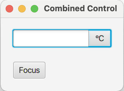
Still not perfect, but good enough, I guess. The tricky part with the focus is that the left side of the button should still show the -fx-outer-border color but the rest of the button not.
So, with all these CSS styles in place, we now have created a new control made out of two existing controls.
That's it for today, stay tuned for Part III of the series same time and place next week, find the code over at github, and happy coding!
- February 05, 2021
- 4 min read
JUG Leader, Java Champion, Speaker, Author, ❤️ Java(FX) and coding in general


Comments (2)
Stephen Nortjé
4 years agoLove your work and posts! I am learning how to create custom controls with your help! Thank you so much! Super excited to learn more from you on this subject.
Adalberto J. Brasaca
2 years agoHi Gerrit... Great work ! This gave me the idea of how to make a control that receives an IP address: textfield(3 numbers) + label(".") + and so on... Thank you.