

Automatically Creating Microservices Architecture Diagrams
- April 20, 2023
- 5 min read
In application development, microservices is an architectural style where larger applications are structured as a collection of smaller, independent, yet interconnected services.
While this allows for highly maintainable and testable applications (as each service can be maintained independent of the larger application), the problem with this method is the inherent complexity of interactions between microservices.
It can be difficult for developers and team members to visualise how these microservices are connected to each other. We have been looking for ways to produce architectural diagrams that illustrate these interactions.
We found that GraphViz helped us to solve part of this problem, as it can take the microservices structure of an application in the DOT language and convert it into a PNG format.
However, we wanted this process to be even more user friendly and more automatic, so that the user would not have to manually generate a DOT file of their microservices architecture.
In-Browser Tool
As we could not find such a tool, we decided to create one ourselves.
We decided that the most user-friendly interface would be to create an in-browser tool that allows the user to upload a JAR file containing a packaged service, and to have an image automatically rendered.
This article discusses how we went about creating this tool and includes an example of what happens ‘behind the scenes’ of this interface.
For our event streaming microservices framework, we used Chronicle Services.
For the scope of this article, I will not focus on the details into Chronicle’s microservices framework; the techniques mentioned in this article could also be applied to many other similar frameworks.
Converting Microservices Architecture to DOT Format
As discussed, with this tool, we are taking a description of the architecture of a microservice-based application and producing a graphical representation of the connections between services. In our case, this ‘description’ is contained in a YAML file called services.yaml.
YAML is a human-friendly data serialisation language. Hence, the first step for our tool is to read the contents from the microservice configuration file (services.yaml) and produce a corresponding DOT file. This link provides some more details on the structure and syntax of DOT language.
GraphViz: DOT to PNG Converter
Once we have this temporary DOT file, we then need to be able to convert it to a PNG image. We chose to use GraphViz (an open-source graph visualisation software) for this process.
The GraphViz tool defines attribute rendering options, so we were able to customise how our images would appear to the user, such as the colours of each component, font types and arrow styles. GraphViz can be downloaded and installed from here. For more information on how to create and customise the attributes, read more here.
Usually, GraphViz is run via the terminal, but we use Java to execute it directly from a web-server, in real-time, on a new microservice configuration file uploaded by the user through the browser. Our tool makes use of Java’s ProcessBuilder, which invokes GraphViz.
There are several options for how to output the PNG (or other file types). In this case, “Tpng:cairo” was chosen for its higher image quality. Depending on your use case, PNG or file output alternatives can be seen here. A simple example of a rendered image can be seen in Figure 1, and below that I will walk through an example of the steps mentioned.
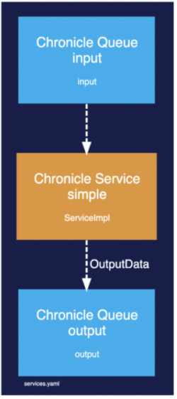
Figure 1. Rendered services.yaml file
Example
Let’s look at an example to illustrate how we can produce an image illustrating a simple service.
1. Reading Chronicle Services Configuration File
The first step is to read the contents of the services.yaml file. The example below depicts what a services.yaml file may contain.
Chronicle Services communicate with each other using Chronicle Queues. So the file defines the queues as well as services. In this case we have only one service, called “simple” that reads input messages from the queue “input” and writes output messages on the queue “output”.
!ChronicleServicesCfg {
  queues: {
    input: { path: input, sourceId: 1 },
    output: { path: output, sourceId: 2 },
  },
  services: {
    simple: {
      inputs: [ input ],
      output: output,
      implClass: !type software.chronicle.services.demo.example1.ServiceImpl,
    },
  },
}
2. Chronicle Services Configuration File to DOT format
Once the services.yaml file has been read, the contents are translated into DOT and written to a file. For this translation to take place, we wrote custom code. Below is an example of what would be written to this DOT file (some sections have been excluded for simplicity).
It starts off with ‘digraph’ to declare that we want a directed graph, and within this we describe its attributes. Under ‘general’ we defined the attributes such as background colour, and below this we defined the graph components (nodes, edges etc.) that should use these attributes.
Of note, services are represented by graph nodes, and queues are represented by edges that connect them.
digraph G {
    # General
    label="services.yaml\l ";
    labeljust="l";
    labelloc = "b";
    fontsize = "6";
    bgcolor="#181F4C";
    fillcolor="#1E252B";
    fontcolor="white";
    fontname="Helvetica";
    pad="0.5";

    # Service simple
    "queue__input" -> "service__simple" [penwidth=2, color="white", style="dashed", fontcolor="white", fontname="Helvetica", label=<<FONT> </FONT>>] ;
    "service__simple" -> "queue__output" [penwidth=2, color="white", style="dashed", fontcolor="white", fontname="Helvetica", label=<<FONT>  OutputData </FONT>>] ;
}
3. DOT to PNG
Now that we have the DOT file that describes how our graph should look, we use GraphViz with the main option “Tpng:cairo” to convert to the graphical representation.
Figure 1 (seen above) is the image generated as a result of the previous two steps.
Complex Services
The example above was simple but real-world examples of applications can contain dozens of microservices and queues.
Figure 2. depicts a sample of a slightly more complex application:
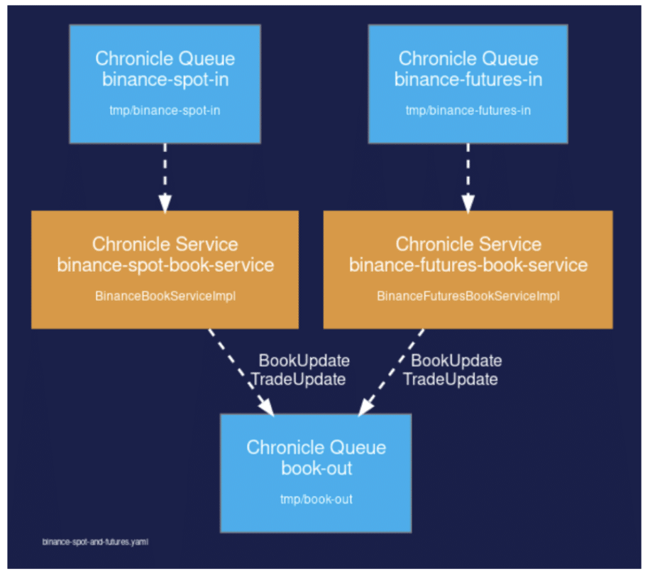
Figure 2. Binance-spot-and-futures.yaml
Additional Framework: Undertow
Because we wanted to have an-browser tool, and as our projects are written in Java, we used Undertow; a flexible and performant web server written in Java and easily added as a dependency to our Java application.
In particular, we made use of the following Undertow APIs. To find out more about these and how to implement them see here:
- Undertow Builder: This API enables you to quickly configure and launch an Undertow server.
- Response Headers: This sets the content type header.
- Response Sender: This API is one way to send a response. The provided string is the complete response and this is what will be sent to the server.
Services Diagram Tool Summary
We called this project Chronicle Services Diagram Tool.
To view the tool in action, click here.
As mentioned, this tool lets users quickly generate an image that effectively illustrates how services are connected in a particular project.
Creating this visual representation of the interactions between services allows developers and other team members to grasp a project’s overall architecture.
This tool works with the Chronicle microservice framework, and it requires a jar file built with this framework to be uploaded to the webpage. It is also key that the file contains at least one valid service config file (services.yaml ); by ‘valid’ services.yaml file we mean that it contains an entry ‘ChronicleServicesCfg’.
If you are using a different microservice framework you could replace the ChronicleServicesCfg config file with your own service configuration file and create your own digraph generator.
If these two aspects are successful, the tool generates a formatted image (PNG) that displays how the project’s different Services relate to each other.
Conclusion
Having architecture diagrams adds to our documentation, but also provides us with a simple and fast tool to view the structure of our projects.
Now we have a way to simply upload a JAR file, and the process of searching for a YAML file, creating a DOT file and then converting this to a PNG all takes place behind the scenes, with just a click of a button.
See here to watch a demo.
- April 20, 2023
- 5 min read
Jasmine Taylor is a Technical Author at Chronicle Software and has recently switched careers from Education to Development. She is now putting her love for learning into coding, with particular focus on Java and JavaScript.


Comments (0)
No comments yet. Be the first.