

Custom Controls in JavaFX (Part III)
- February 12, 2021
- 7 min read
If you've been following this series of blog posts, you already read about how to create custom controls by re-styling existing controls or combining existing controls. This time let me show you how to create a custom JavaFX control by extending an existing control.
The goal for today is to create a TextField that looks similar to the TextField that you can find in MaterialDesign.
I use MaterialDesign because it is really popular but be aware that it is not really made for Desktop applications. The reason for this is simple, it needs a lot of space in the vertical direction which makes sense if you keep in mind that it was made for mobile devices where the screen orientation is vertical as where the screen orientation of desktops is horizontal.
Meaning to say that on desktops you have more horizontal space than vertical space and if you create a desktop app using MaterialDesign components you will find yourself very quickly in "scrolling hell" because the app won't fit vertically on the screen.
Nevertheless, let's take a look at the MaterialDesign TextField because it has some nice features like moving text etc.
If you usually use TextFields in your app you often put a Label in front of the TextField that describes the content of the TextField e.g "Name" etc.
The MaterialDesign TextField has this Label built in and the interesting effect is that this Label is acting as a placeholder for the text as long as the TextField is empty. As soon as the TextField gets the focus the Label will move upwards and will stay on top of the content of the TextField.
So we will extend a JavaFX TextField component and add a Text component (in JavaFX the Text is a Shape) that will keep the description. Now we have to place this Text component over the TextField and move it to the top of the TextField when this gets the focus.
The MaterialDesign TextField even comes with more features like an assistive text below the TextField and icons but we won't add those here.
A special case we have to keep an eye on is the case where the TextField is readonly or editable = false;.
The problem is that cannot easily see if the TextField is readonly or disabled and for that reason we will draw the line below the text dashed in case the TextField is readonly. The reason for this is maybe not obvious but it can be important. In a TextField that is disabled you cannot select the text for a copy operation but in a TextField that is readonly you can select the text and copy it. So it makes sense to visualize the readonly state in a different way than the disabled state.
Here are the things we need to do...
- Extend the JavaFX TextField
- Add a Text to it that can be set using the promptTextProperty
- Add animation of the Text dependent on the focus state
- Add some CSS styling
First step is to extend the TextField...
public class ExtendedControl extends TextField {
    private static final StyleablePropertyFactory<ExtendedControl> FACTORY = new StyleablePropertyFactory<>(TextField.getClassCssMetaData());
    private static final Color DEFAULT_MATERIAL_DESIGN_COLOR = Color.web("#009688");
    private static final Color DEFAULT_PROMPT_TEXT_COLOR  = Color.web("#757575");
    private static final double STD_FONT_SIZE = 13;
    private static final double SMALL_FONT_SIZE = 10;
    private static final double TOP_OFFSET_Y = 4;
    private static final int ANIMATION_DURATION = 60;
    private static final CssMetaData<ExtendedControl, Color> MATERIAL_DESIGN_COLOR = FACTORY.createColorCssMetaData("-material-design-color", s -> s.materialDesignColor, DEFAULT_MATERIAL_DESIGN_COLOR, false);
    private static final CssMetaData<ExtendedControl, Color> PROMPT_TEXT_COLOR = FACTORY.createColorCssMetaData("-prompt-text-color", s -> s.promptTextColor, DEFAULT_PROMPT_TEXT_COLOR, false);
    private static String userAgentStyleSheet;
    private final StyleableProperty<Color> materialDesignColor;
    private final StyleableProperty<Color> promptTextColor;
    private Text promptText;
    private HBox promptTextBox;
    private DoubleProperty fontSize;
    private Timeline timeline;

    // ******************** Constructors **************************************
    public ExtendedControl() {
        this("");
    }
    public ExtendedControl(final String promptTextBox) {
        super(promptTextBox);

        materialDesignColor = new SimpleStyleableObjectProperty<>(MATERIAL_DESIGN_COLOR, this, "materialDesignColor");
        promptTextColor = new SimpleStyleableObjectProperty<>(PROMPT_TEXT_COLOR, this, "promptTextColor");

        fontSize = new SimpleDoubleProperty(ExtendedControl.this, "fontSize", getFont().getSize());
        timeline = new Timeline();

        initGraphics();
        registerListeners();
    }
You can see in the code above that we also created some styleable properties for the materialDesignColor and the promptTextColor. I won't go into detail about how to use styleable properties in JavaFX. If you would like to know more about it you might want to check the interwebz for that.
Now that we have defined the variables we need it's time to add them to the existing control (which I always do in a method called initGraphics()).
private void initGraphics() {
    getStyleClass().addAll("material-field");

    final String fontFamily = getFont().getFamily();
    final int length = getText().length();

    promptText = new Text(getPromptText());
    promptText.getStyleClass().add("prompt-text");

    promptTextBox = new HBox(promptText);
    promptTextBox.getStyleClass().add("material-field");

    if (!isEditable() || isDisabled() || length > 0) {
        promptText.setFont(Font.font(fontFamily, SMALL_FONT_SIZE));
        promptTextBox.setTranslateY(-STD_FONT_SIZE - TOP_OFFSET_Y);
    } else {
        promptText.setFont(Font.font(fontFamily, STD_FONT_SIZE));
    }

    getChildren().addAll(promptTextBox);
}
In this method we set the style class "material-field" to th component itself, create the Text, put it in an HBox and add this HBox to the TextField component. The reason for not simply adding the Text only but putting it into an HBox is mainly for layout reasons. It might also come in handy if we want to add an icon to the Text.
The most important thing in our control is changing the state from not focused to focused. Because when this happens we need to animate the Text.
For this reason, we need to attach some listeners to different properties that we are interested in. This happens in the registerListeners() method which looks as follows:
private void registerListeners() {
    textProperty().addListener(o -> handleTextAndFocus(isFocused()));
    promptTextProperty().addListener(o -> promptText.setText(getPromptText()));
    focusedProperty().addListener(o -> handleTextAndFocus(isFocused()));
    promptTextColorProperty().addListener(o -> promptText.setFill(getPromptTextColor()));
    fontSize.addListener(o -> promptText.setFont(Font.font(fontSize.get())));
    timeline.setOnFinished(evt -> {
        final int length = null == getText() ? 0 : getText().length();
        if (length > 0 && promptTextBox.getTranslateY() >= 0) {
            promptTextBox.setTranslateY(-STD_FONT_SIZE - TOP_OFFSET_Y);
            fontSize.set(SMALL_FONT_SIZE);
        }
    });
}
We added listeners to textProperty, promptTextProperty, focusedProperty, promptTextColorProperty and fontSize.
Instead of adding a listener to the promptTextProperty and set our Text when it changes, we could also bind the textProperty of the Text component directly to the promptTextProperty of the TextField (I just don't like bindings).
In this method I also added a listener to the timeline that will be triggered when the timeline will be finished. In this case it will be checked if the TextField contains text and if this is the case the Text component will be placed at the correct position.
You already saw in the code above that I call a method named handleTextAndFocus() in case the text and/or the focus changed. This method is responsible for moving our Text Component up and down and change it's color.
So let's take a look at this method...
private void handleTextAndFocus(final boolean isFocused) {
    final int length = null == getText() ? 0 : getText().length();

    KeyFrame kf0;
    KeyFrame kf1;

    KeyValue kvTextY0;
    KeyValue kvTextY1;
    KeyValue kvTextFontSize0;
    KeyValue kvTextFontSize1;
    KeyValue kvPromptTextFill0;
    KeyValue kvPromptTextFill1;

    if (isFocused | length > 0 || isDisabled() || !isEditable()) {
        if (Double.compare(promptTextBox.getTranslateY(), -STD_FONT_SIZE - TOP_OFFSET_Y) != 0) {
            kvTextY0 = new KeyValue(promptTextBox.translateYProperty(), 0);
            kvTextY1 = new KeyValue(promptTextBox.translateYProperty(), -STD_FONT_SIZE - TOP_OFFSET_Y);
            kvTextFontSize0 = new KeyValue(fontSize, STD_FONT_SIZE);
            kvTextFontSize1 = new KeyValue(fontSize, SMALL_FONT_SIZE);
            kvPromptTextFill0 = new KeyValue(promptTextColorProperty(), DEFAULT_PROMPT_TEXT_COLOR);
            kvPromptTextFill1 = new KeyValue(promptTextColorProperty(), isFocused ? getMaterialDesignColor() : DEFAULT_PROMPT_TEXT_COLOR);

            kf0 = new KeyFrame(Duration.ZERO, kvTextY0, kvTextFontSize0, kvPromptTextFill0);
            kf1 = new KeyFrame(Duration.millis(ANIMATION_DURATION), kvTextY1, kvTextFontSize1, kvPromptTextFill1);

            timeline.getKeyFrames().setAll(kf0, kf1);
            timeline.play();
        }
        promptText.setFill(isFocused ? getMaterialDesignColor() : DEFAULT_PROMPT_TEXT_COLOR);
    } else {
        if (Double.compare(promptTextBox.getTranslateY(), 0) != 0) {
            kvTextY0 = new KeyValue(promptTextBox.translateYProperty(), promptTextBox.getTranslateY());
            kvTextY1 = new KeyValue(promptTextBox.translateYProperty(), 0);
            kvTextFontSize0 = new KeyValue(fontSize, SMALL_FONT_SIZE);
            kvTextFontSize1 = new KeyValue(fontSize, STD_FONT_SIZE);
            kvPromptTextFill0 = new KeyValue(promptTextColorProperty(), getMaterialDesignColor());
            kvPromptTextFill1 = new KeyValue(promptTextColorProperty(), DEFAULT_PROMPT_TEXT_COLOR);

            kf0 = new KeyFrame(Duration.ZERO, kvTextY0, kvTextFontSize0, kvPromptTextFill0);
            kf1 = new KeyFrame(Duration.millis(ANIMATION_DURATION), kvTextY1, kvTextFontSize1, kvPromptTextFill1);

            timeline.getKeyFrames().setAll(kf0, kf1);
            timeline.play();
        }
    }
}
This method is checking if the TextField is focused or contains text, is disabled or is not editable. In all of these cases it will create an animation where the Text component will move up. In all other cases where the Text is already at the upper position, the Text will move down. In the animation not only the position of the Text component will change but also the font size and the color.
And if the TextField contains text and doesn't have the focus we have to make sure that the Text component will be filled with the gray DEFAULT_PROMPT_TEXT_COLOR color.
In principle this is more or less all Java code that is needed to achieve the behavior we would like to see...BUT...it also needs some CSS to make it look all right.
In the CSS file, we have to make sure that the prompt-text that is part of the TextField control won't appear at all. For this we simply set the -fx-prompt-text-color: transparent;
In addition we also need to make sure that control has no complete border and no background fill but only has a line at the bottom. This line should change it's color in case the TextField is focused and it should change it's style in case the TextField is readonly. The line is also a bit thicker if focused than it it is not focused.
And here is the final piece...the CSS code...
.material-field {
    -material-design-color: #3f51b5;
    -material-design-color-transparent: #3f51b51f;
    -prompt-text-color: #757575;
}
.material-field:readonly {
    -fx-prompt-text-fill: transparent;
}
.material-field:disabled {
    -fx-prompt-text-fill: transparent;
}

.text-input {
    -fx-font-family: "Arial";
    -fx-font-size: 13px;
    -fx-text-fill: -fx-text-inner-color;
    -fx-highlight-fill: derive(-fx-control-inner-background,-20%);
    -fx-highlight-text-fill: -fx-text-inner-color;
    -fx-prompt-text-fill: transparent;
    -fx-background-color: transparent;
    -fx-background-insets: 0;
    -fx-background-radius: 0;
    -fx-border-color: transparent transparent #616161 transparent;
    -fx-border-width: 1;
    -fx-border-insets: 0 0 1 0;
    -fx-border-style: hidden hidden solid hidden;
    -fx-cursor: text;
    -fx-padding: 0.166667em 0em 0.333333em 0em;
}
.text-input:focused {
    -fx-highlight-fill: -material-design-color-transparent;
    -fx-highlight-text-fill: -material-design-color;
    -fx-text-fill: -fx-text-inner-color;
    -fx-background-color: transparent;
    -fx-border-color: transparent transparent -material-design-color transparent;
    -fx-border-width: 2;
    -fx-border-insets: 0 0 2 -1;
    -fx-prompt-text-fill: transparent;
    -fx-padding: 2 0 4 0;
}
.text-input:readonly {
    -fx-background-color: transparent;
    -fx-text-fill: derive(-fx-text-base-color, 35%);
    -fx-border-style: segments(2, 3)  line-cap butt;
    -fx-border-color: transparent transparent #616161 transparent;
}
.text-input:focused:readonly {
    -fx-text-fill: derive(-fx-text-base-color, 35%);
    -fx-border-style: segments(2, 3)  line-cap butt;
    -fx-border-color: transparent transparent -material-design-color transparent;
}
.text-input:disabled {
    -fx-opacity: 0.46;
    -fx-border-style: segments(2, 3)  line-cap butt;
    -fx-border-color: transparent transparent black transparent;
}
Well that's a lot of CSS but unfortunately it is needed to get the final result. I won't go through all the lines because it is simply too much. The important parts should be easy to understand. We define the styles for the standard .text-input so that it has no full border, no background color, transparent prompt-text, no corner radii etc.
Then we adjust some of these styles for the different states like :readonly, :focused, :disabled etc.
The final result of our control will then look like this...
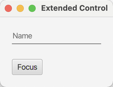
Above: Standard design without focus.
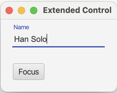
Above: Focused with content.
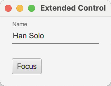
Above: Not focused with content.
To see the animation in action the best thing to do is to check out the code at github and play around with the parameters.
That's it for today, so stay tuned for Part IV of the series and keep coding!
- February 12, 2021
- 7 min read
JUG Leader, Java Champion, Speaker, Author, ❤️ Java(FX) and coding in general


Comments (1)
Tom
5 years agoGreat article again! How the code is distributed over methods is educational. Personally I would have put comments in (at least) the handleTextAndFocus method, because that is a daunting set of lines to work through, if you were to maintain that. When doing animations that quickly is the case.