


Unleashing the Power of Data Visualization: Introducing BX-Charts for BoxLang
- December 02, 2025
- 3 min read
In the world of modern web applications, data is king—but raw numbers rarely tell the full story. 📈 That's where visualization becomes crucial, transforming complex datasets into intuitive, compelling narratives. Today, we're thrilled to introduce BX-Charts, a game-changing charting module that brings professional-grade data visualization directly into the BoxLang ecosystem. 🌟
The Visualization Challenge 🧩
Developers have long struggled with creating meaningful charts:
- 🔧 Complex JavaScript libraries
- 🏗️ Extensive configuration
- 📚 Steep learning curves
- 🚧 Limited flexibility
BX-Charts demolishes these barriers, offering a seamless, powerful charting solution that's both developer-friendly and enterprise-ready. 💪
Fully Documented
We love ❤️ docs! We have fully documented our module: https://boxlang.ortusbooks.com/boxlang-framework/modularity/charts
Fully Supported
If you have one of our +/++ licenses, you will get personalized support and implementation advice: https://www.boxlang.io/plans
Code Samples: Bringing Data to Life
- Multi-Series Performance Analysis with Per-Series Border Styling
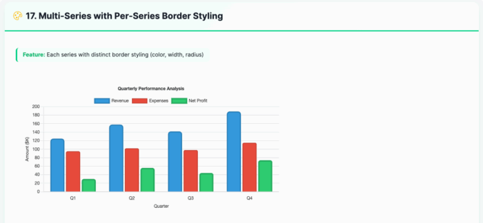
<bx:chart title="Quarterly Performance Analysis" chartwidth="700" chartheight="400" xaxistitle="Quarter" yaxistitle="Amount ($K)" showlegend="true" showygridlines="true" backgroundcolor="##ffffff"> <bx:chartseries type="bar" colorlist="3498db" serieslabel="Revenue" bordercolor="##2980b9" borderwidth="3" borderradius="8"> <bx:chartdata item="Q1" value="125" /> <bx:chartdata item="Q2" value="158" /> <bx:chartdata item="Q3" value="142" /> <bx:chartdata item="Q4" value="189" /> </bx:chartseries> <bx:chartseries type="bar" colorlist="e74c3c" serieslabel="Expenses" bordercolor="##c0392b" borderwidth="2" borderradius="4"> <bx:chartdata item="Q1" value="95" /> <bx:chartdata item="Q2" value="102" /> <bx:chartdata item="Q3" value="98" /> <bx:chartdata item="Q4" value="115" /> </bx:chartseries> </bx:chart> - Line Chart with Variable Border Widths
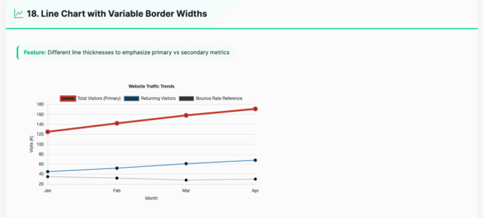
<bx:chart title="Website Traffic Trends" chartwidth="700" chartheight="400" xaxistitle="Month" yaxistitle="Visits (K)" showlegend="true" showygridlines="true" showmarkers="true" backgroundcolor="##ffffff"> <bx:chartseries type="line" colorlist="e74c3c" serieslabel="Total Visitors (Primary)" bordercolor="##c0392b" borderwidth="5"> <bx:chartdata item="Jan" value="125" /> <bx:chartdata item="Feb" value="142" /> <bx:chartdata item="Mar" value="158" /> <bx:chartdata item="Apr" value="171" /> </bx:chartseries> <bx:chartseries type="line" colorlist="3498db" serieslabel="Returning Visitors" bordercolor="##2980b9" borderwidth="2"> <bx:chartdata item="Jan" value="45" /> <bx:chartdata item="Feb" value="52" /> <bx:chartdata item="Mar" value="61" /> <bx:chartdata item="Apr" value="68" /> </bx:chartseries> </bx:chart> - Responsive Dashboard Layout
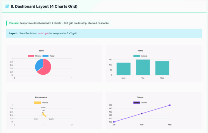
<div class="row g-3"> <div class="col-lg-6"> <bx:chart title="Sales" chartwidth="400" chartheight="250" responsive="true" maintainAspectRatio="true"> <bx:chartseries type="pie" colorlist="FF6384,36A2EB" serieslabel="Sales"> <bx:chartdata item="Online" value="65" /> <bx:chartdata item="Retail" value="35" /> </bx:chartseries> </bx:chart> </div> <div class="col-lg-6"> <bx:chart title="Traffic" chartwidth="400" chartheight="250" responsive="true" maintainAspectRatio="true" showygridlines="true"> <bx:chartseries type="bar" colorlist="4BC0C0" serieslabel="Visitors"> <bx:chartdata item="Mon" value="120" /> <bx:chartdata item="Tue" value="150" /> <bx:chartdata item="Wed" value="135" /> </bx:chartseries> </bx:chart> </div> </div> - Background and Font Styling
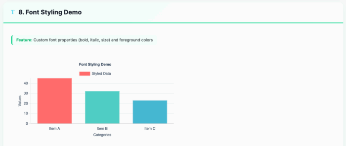
<bx:chart format="canvas" title="Font Styling Demo" backgroundcolor="##ffffff" chartheight="300" chartwidth="600" showlegend="true" fontbold="true" fontitalic="true" fontsize="14" foregroundcolor="##2E4057" xaxistitle="Categories" yaxistitle="Values"> <bx:chartseries type="bar" colorlist="FF6B6B,4ECDC4,45B7D1" serieslabel="Styled Data"> <bx:chartdata item="Item A" value="45" /> <bx:chartdata item="Item B" value="32" /> <bx:chartdata item="Item C" value="23" /> </bx:chartseries> </bx:chart> - Bubble Chart for Multi-Dimensional Analysis
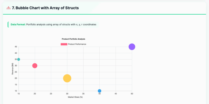
<bx:chart title="Product Portfolio Analysis"
          chartwidth="600" chartheight="350"
          xaxistitle="Market Share (%)"
          yaxistitle="Revenue (millions)"
          showxgridlines="true"
          showygridlines="true">
    <bx:chartseries type="bubble"
                    colorlist="9966FF,36A2EB,FF6384,FFCE56"
                    serieslabel="Products">
        <bx:chartdata item="Product A" x="20" y="85" r="15" />
        <bx:chartdata item="Product B" x="35" y="120" r="20" />
        <bx:chartdata item="Product C" x="15" y="65" r="10" />
        <bx:chartdata item="Product D" x="25" y="95" r="12" />
    </bx:chartseries>
</bx:chart>
Exploring the Possibilities 🔍
We've built an interactive Chart Explorer at charts.boxlang.io, where you can:
- Browse live chart examples
- View source code
- Experiment with different chart configurations
- Learn best practices for data visualization
Installation 🔧
Get started with BX-Charts
# CommandBox Web Apps
box install bx-charts

# Core OS or Other Runtimes
install-bx-module bx-charts
Key Features
- 📊 10 Chart Types
- 📱 Fully Responsive
- 🎨 Customizable Styling
- 🔗 Easy Data Integration
- 🚀 Performance Optimized
Developers, Unleash Your Data! 🌍
Whether you're building business intelligence dashboards, scientific visualizations, or performance reports, BX-Charts provides the flexibility and power you need. 🔍
Ready to transform your data into insights? BX-Charts is here. 🌟
- December 02, 2025
- 3 min read
Development and promotion of BoxLang, a modern dynamic JVM language deployable on various platforms, including all operating systems, web servers, Java application servers, AWS Lambda, iOS, Android, web assembly, and more.


Comments (0)
No comments yet. Be the first.