

Custom Controls in JavaFX (Part V)
- February 26, 2021
- 8 min read
In the last article, I showed you how to create a custom control based on the Control plus Skin approach, which is great for building controls libraries.
This time, I will show you how to create a JavaFX Custom Control that is based on the JavaFX Region class. The Region class is the class that all JavaFX controls are based on. It is a resizable Parent node which can be styled from CSS. This is the class that you would want to use when building a JavaFX custom control that is not part of a controls library.
The main difference between the Region and the Control + Skin based approach is the fact that the Region based control contains both, the control logic and the UI where the Control + Skin based control separates the logic from the UI. The logic can be found in the Control and the UI can be found in the Skin.
Because the last article was really long, I will try to make this one a bit shorter. For that reason, the control we create today will be a more simple one.
I'm working on a Mac and, as you all know, the UI of MacOS has it's own design elements. One of the things that you can find in all the OS X variants are the three buttons (red, yellow, green) on each window that can be used to close, minimize and zoom a window.
You might ask yourself why there is a need for such a button because the JavaFX stage which is platform-dependent comes with these buttons automatically. Well... the problem is that the dark mode of MacOS is not yet directly supported by JavaFX, which means that if you create a JavaFX app and run your MacOS in dark mode, the frame of your app will be displayed in light mode 🙁
In such a case, you can completely switch out of the window frame and create your own one and then... you need these buttons. 🙂
For those of you that have no idea what I'm talking about... here is a screenshot of the buttons:
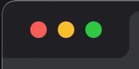
Not really fancy, right... well, they also show some symbols when you hover over them, but we will come to that later.
So, we need to create a control that shows a colored circle and, if the mouse moves over it, a symbol will be shown.
And as always... first thing to do is to open our vector drawing program and create the circles with their colors to get a better idea on how to implement them correctly:
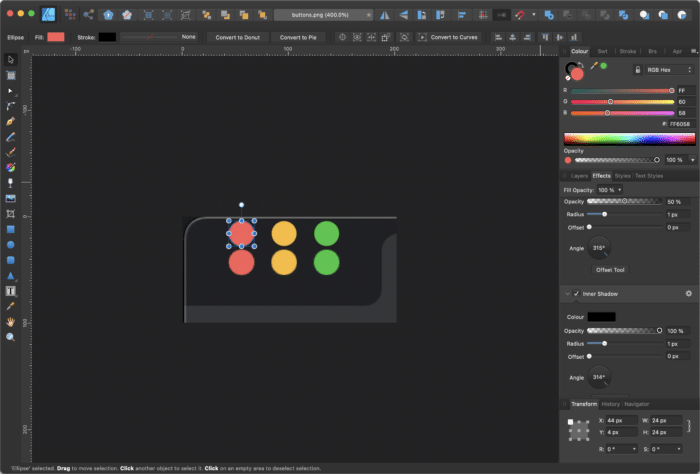
If I copy an existing control I usually load the screen shot of the control as a background image into my vector drawing program and draw the copy over the screen shot. With this approach you directly get the correct screen size, placement and colors.
Now that we have the circles with their sizes, distances and colors in place we also need to add the symbols. Well that's the more time consuming part because we have to draw the symbols manually. To make it more easy for you to get idea, I've added the SVG file that I used to create the buttons to the source code of the region based control.
Usually we could use the :hover pseudo class that is already available in JavaFX to show/hide the symbols on the buttons but in this case we need to create our own :hovered pseudo class. The reason for this is that in MacOS all buttons show their symbols as soon as you hover over one of them. In code this means we will put the buttons in an HBox and add a MouseListener that will set all buttons to :hovered when the mouse is over the HBox. But for this we need a property that we can trigger to show the symbols.
The control consists of two elements, a Circle and a Region. In principle one could also get rid of the circle and simply set the background radius of the control itself but I will keep the circle. The circle is a shape and has not a -fx-background-color and -fx-border-color but -fx-fill and -fx-stroke. So the CSS will look a bit different as the other ones that we already had.
Because we know exactly what colors we need, we won't add a styleable property for the color but pre-define the three colors in CSS.
And with this we only need properties for the type (close, minimize and zoom) and the hovered state and that's it.
The other nice thing about this control is that there is no need to resize it because it will always have the same size. Nevertheless I will leave the resizing code in the control in case someone would like to play around with it. In this case, you only have to increase the MAXIMUM_WIDTH and MAXIMUM_HEIGHT in the control, which are currently fixed to 12px.
Now let's take a look at the code, first the variables we need...
public class RegionControl extends Region {
    public enum Type { CLOSE, MINIMIZE, ZOOM }

    private static final double PREFERRED_WIDTH = 12;
    private static final double PREFERRED_HEIGHT = 12;
    private static final double MINIMUM_WIDTH = 12;
    private static final double MINIMUM_HEIGHT = 12;
    private static final double MAXIMUM_WIDTH = 12;
    private static final double MAXIMUM_HEIGHT = 12;
    private static final PseudoClass CLOSE_PSEUDO_CLASS = PseudoClass.getPseudoClass("close");
    private static final PseudoClass MINIMIZE_PSEUDO_CLASS = PseudoClass.getPseudoClass("minimize");
    private static final PseudoClass ZOOM_PSEUDO_CLASS = PseudoClass.getPseudoClass("zoom");
    private static final PseudoClass HOVERED_PSEUDO_CLASS = PseudoClass.getPseudoClass("hovered");
    private static final PseudoClass PRESSED_PSEUDO_CLASS = PseudoClass.getPseudoClass("pressed");
    private BooleanProperty hovered;
    private static String userAgentStyleSheet;
    private ObjectProperty<Type> type;
    private double size;
    private double width;
    private double height;
    private Circle circle;
    private Region symbol;
    private Consumer<MouseEvent> mousePressedConsumer;
    private Consumer<MouseEvent> mouseReleasedConsumer;
We have defined an enum for the three different states and for each state we also created a PseudoClass. In addition to these, we also created PseudoClasses for the hovered and pressed state.
For hovered and type we also created properties to be able to get/set these from outside of the control.
Because this control is a button, we added consumers for mouse pressed and mouse released to be able to attach our own handlers later on.
In the constructor, we add a parameter for the type and if no type will be provided we default the type to close. The code for the constructor looks like this:
public RegionControl() {
        this(Type.CLOSE);
    }
    public RegionControl(final Type type) {
        this.type = new ObjectPropertyBase<>(type) {
            @Override protected void invalidated() {
                switch(get()) {
                    case CLOSE -> {
                        pseudoClassStateChanged(CLOSE_PSEUDO_CLASS, true);
                        pseudoClassStateChanged(MINIMIZE_PSEUDO_CLASS, false);
                        pseudoClassStateChanged(ZOOM_PSEUDO_CLASS, false);
                    }
                    case MINIMIZE -> {
                        pseudoClassStateChanged(CLOSE_PSEUDO_CLASS, false);
                        pseudoClassStateChanged(MINIMIZE_PSEUDO_CLASS, true);
                        pseudoClassStateChanged(ZOOM_PSEUDO_CLASS, false);
                    }
                    case ZOOM -> {
                        pseudoClassStateChanged(CLOSE_PSEUDO_CLASS, false);
                        pseudoClassStateChanged(MINIMIZE_PSEUDO_CLASS, false);
                        pseudoClassStateChanged(ZOOM_PSEUDO_CLASS, true);
                    }
                }
            }
            @Override public Object getBean() { return RegionControl.this; }
            @Override public String getName() { return "type"; }
        };
        this.hovered = new BooleanPropertyBase() {
            @Override protected void invalidated() { pseudoClassStateChanged(HOVERED_PSEUDO_CLASS, get()); }
            @Override public Object getBean() { return RegionControl.this; }
            @Override public String getName() { return "hovered"; }
        };

        pseudoClassStateChanged(CLOSE_PSEUDO_CLASS, Type.CLOSE == type);
        pseudoClassStateChanged(MINIMIZE_PSEUDO_CLASS, Type.MINIMIZE == type);
        pseudoClassStateChanged(ZOOM_PSEUDO_CLASS, Type.ZOOM == type);

        initGraphics();
        registerListeners();
    }
In the constructor, you can see that we set the pseudo class for the type in the invalidated() method of the type property. With this you can also change the type at runtime and it will apply the correct style (even if this is not really needed here).
To make sure the initial type will be set correctly, we call the pseudoClassStateChanged method for the close, minimize and zoom pseudo classes with the given type parameter from the constructor.
After that the initGraphics() and registerListeners() method will be called which looks like follows:
private void initGraphics() {
        if (Double.compare(getPrefWidth(), 0.0) <= 0 || Double.compare(getPrefHeight(), 0.0) <= 0 || Double.compare(getWidth(), 0.0) <= 0 ||
            Double.compare(getHeight(), 0.0) <= 0) {
            if (getPrefWidth() > 0 && getPrefHeight() > 0) {
                setPrefSize(getPrefWidth(), getPrefHeight());
            } else {
                setPrefSize(PREFERRED_WIDTH, PREFERRED_HEIGHT);
            }
        }

        getStyleClass().add("region-based");

        circle = new Circle();
        circle.getStyleClass().add("circle");
        circle.setStrokeType(StrokeType.INSIDE);

        symbol = new Region();
        symbol.getStyleClass().add("symbol");

        getChildren().setAll(circle, symbol);
    }

    private void registerListeners() {
        widthProperty().addListener(o -> resize());
        heightProperty().addListener(o -> resize());
        addEventFilter(MouseEvent.MOUSE_PRESSED, e -> {
            pseudoClassStateChanged(PRESSED_PSEUDO_CLASS, true);
            if (null == mousePressedConsumer) { return; }
            mousePressedConsumer.accept(e);
        });
        addEventFilter(MouseEvent.MOUSE_RELEASED, e -> {
            pseudoClassStateChanged(PRESSED_PSEUDO_CLASS, false);
            if (null == mouseReleasedConsumer) { return; }
            mouseReleasedConsumer.accept(e);
        });
    }
As already mentioned you can see in the initGraphics() method that we set up a Circle and a Region which we add to our control. To make sure the styles in our CSS file will be used we add the "region-based" style class to our control, the "circle" class to the Circle and the "symbol" class to the Region which should show the symbol.
In the registerListeners() method we add the usual listeners to the size (as mentioned in another post, you could also do the whole resizing/repainting in the layoutChildren() method). In addition to these listeners we setup two EventFilter that should catch all MouseEvents of the types MOUSE_PRESSED and MOUSE_RELEASED and forward them to the mousePressedConsumer and mouseReleasedConsumer if they are available. In the EventFilter methods we also make sure that the pressed pseudo class will be set to change the style of our control when it will be pressed.
The rest of the control code is nothing really special and I won't go into detail here.
More interesting is the CSS file that we need to create because it contains all the "magic" of the UI. So here it is:
.region-based {
    -RED: #ff6058;
    -YELLOW: #ffbc35;
    -GREEN: #00c844;
    -GRAY: #535353;
    -DARK_GRAY: #343535;
}

.region-based .circle {
    -fx-stroke-width: 0.5px;
}

.region-based:close .circle,
.region-based:close:hovered .circle {
    -fx-fill: -RED;
    -fx-stroke: derive(-RED, -10%);
}
.region-based:close:pressed .circle {
    -fx-fill: derive(-RED, -20%);
    -fx-stroke: derive(-RED, -30%);
}

.region-based:minimize .circle,
.region-based:minimize:hovered .circle {
    -fx-fill: -YELLOW;
    -fx-stroke: derive(-YELLOW, -10%);
}
.region-based:minimize:pressed .circle {
    -fx-fill: derive(-YELLOW, -20%);
    -fx-stroke: derive(-YELLOW, -30%);
}

.region-based:zoom .circle,
.region-based:zoom:hovered .circle {
    -fx-fill: -GREEN;
    -fx-stroke: derive(-GREEN, -10%);
}
.region-based:zoom:pressed .circle {
    -fx-fill: derive(-GREEN, -20%);
    -fx-stroke: derive(-GREEN, -30%);
}

.region-based:disabled:close .circle,
.region-based:disabled:minimize .circle,
.region-based:disabled:zoom .circle {
    -fx-fill: -GRAY;
    -fx-stroke: transparent;
}

.region-based:close .symbol,
.region-based:minimize .symbol,
.region-based:zoom .symbol {
    -fx-background-color: transparent;
}

.region-based:hovered:close .symbol {
    -fx-background-color: -DARK_GRAY;
    -fx-border-color: -DARK_GRAY;
    -fx-scale-shape: false;
    -fx-shape: "M6.001,5.429l2.554,-2.555l0.571,0.571l-2.555,2.554l2.55,2.55l-0.572,0.572l-2.55,-2.55l-2.554,2.555l-0.571,-0.571l2.555,-2.554l-2.55,-2.55l0.572,-0.572l2.55,2.55Z";
}
.region-based:hovered:minimize .symbol {
    -fx-background-color: -DARK_GRAY;
    -fx-scale-shape: false;
    -fx-shape: "M2.0,5.5l8,0l0,1l-8,0l0,-1Z";
}
.region-based:hovered:zoom .symbol {
    -fx-background-color: -DARK_GRAY;
    -fx-scale-shape: false;
    -fx-shape: "M2.696,2.582l4.545,0.656l-3.889,3.889l-0.656,-4.545ZM9.533,9.418l-0.656,-4.545l-3.889,3.889l4.545,0.656Z";
}
As mentioned earlier we know all colors that we need and for this reason we can directly define them in our CSS file. We have colors for the different states (-RED, -YELLOW, -GREEN), for the disabled state (-GRAY) and for the symbol (-DARK_GRAY).
The original MacOS button looks like it either has an inner shadow or a border that is a bit darker than the fill color. For this reason we set the stroke to 0.5px. This also means we have to define a stroke color that should be a bit darker than the fill color.
This can easily be done in JavaFX CSS by using the derive method. If we would like to create a border that has a darker red color we can achieve it as follows:
-fx-stroke: derive(-RED, -10%);
This code will create a color based on the color defined for -RED which is 10% darker than the given color.
We will use the same technique for the pressed state where the fill and the stroke color should be darker than the original colors to indicate the pressed state.
As you see, we have some code for each state (:close, :minimize, :zoom, :hovered, :pressed) and also for the combination of these states.
There are of course other solutions that you can use to achieve the exact same result. Meaning to say, the technique that I used in this control by combining CSS PseudoClasses for styling the control is not the only way of creating those effects and you should also try other techniques. There is no general rule how to create and style your controls, so you always have to check all possibilities and take the approach that fits best for you.
As always please find the code over at github.
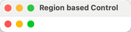
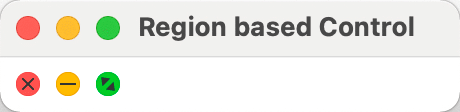
Here are two screenshots of the Region based control that shows the normal and the hovered state.
Normal state:
Hovered state:
And that's it for today... so, keep coding!
- February 26, 2021
- 8 min read
JUG Leader, Java Champion, Speaker, Author, ❤️ Java(FX) and coding in general


Comments (0)
No comments yet. Be the first.